Role: UX Research, User Interface Design, Prototyping, Visual Branding, Digital Illustration
Time Frame: 3.5 months
Tools: Adobe XD, Illustrator, Photoshop, Sticky Notes, Research
App Thought:
To start out with our app design, we created ideas that we thought would be interesting and then we decided to think of problems that our app could solve. We thought about homelessness, animal shelters, donating, product affordability, recycling and repurposing. The first problem we faced is how those ideas are able to tie together. We decided to create an app where we can solve the problem of needing or not wanting by creating an app that has a two-way system of donating, but also receiving.
About Research Stage:
The research stage was divided between three tasks collections and used the previous data of each research process for the next to collect accurate and consistent data throughout.
Survey:
For the survey research purpose we created an online document that asked questions that targeted people’s incline to donating or purchasing secondhand. We asked them to tell us about their process and experience with donating and then offered them some alternative solutions to determine whether they would partake in these methods to make the process more helpful.
Empathy Map:
Our next step in the research phase was to create an empathy map where we took into account what our app has to offer and how these would make you feel, what the app has to say, concerns with the app as well as what the app is capable of and rated them on the most urgent to least.
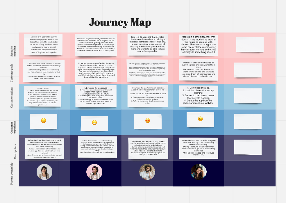
Journey Map/Persona:
The following step took two types of research processes and combined them into a hybrid by mixing a journey map and persona research. We created four characters and designed a scenario or background of the persona, while taking them through the process of why they would use this app by creating goals, actions, experiences and touchpoints that can help us base them off real world experiences of a variety using our app.


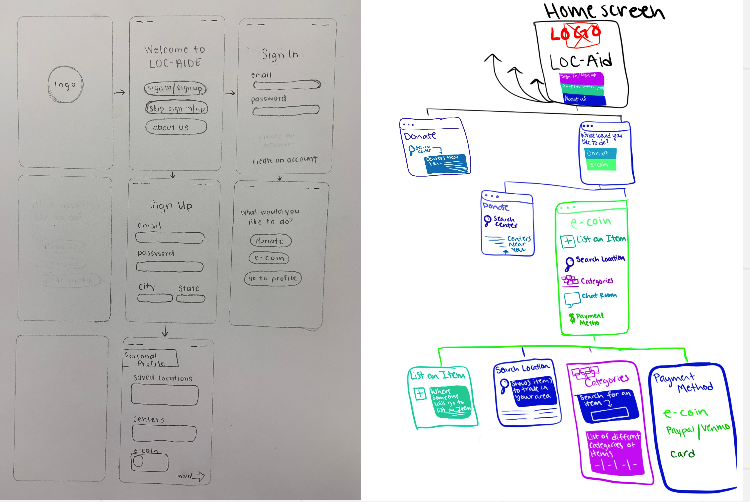
Site Map:
After conducting research, we took into account all the common pain points, as well as the selling points and created a site map. This allows us to create a rough production of our app and design it by allowing us to layout specific functions and how the user would navigate our app.
We used the online source Octopus to create a realistic navigation system for our app divided the functions by color and type of action sequence the user would have when functioning the app.

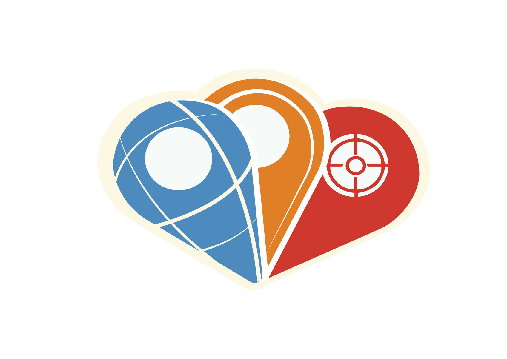
Logo Design:
In between the site map and the next step, we took some time to think about the creation of the logo design. This role serves a purpose of creating a visual face of the application and role of keeping the brand of Loc-Aide consistent.
The logo process went through several rounds of variations and designs, all relying on a common interest of the app being able to use location services and utilizing a location market or drop pin. Elements such as color, and different line works were experimented in the process as well as altering the shape of the location marker. The final logo, takes information from the services of the app and combines them with the logo.

Color Palette

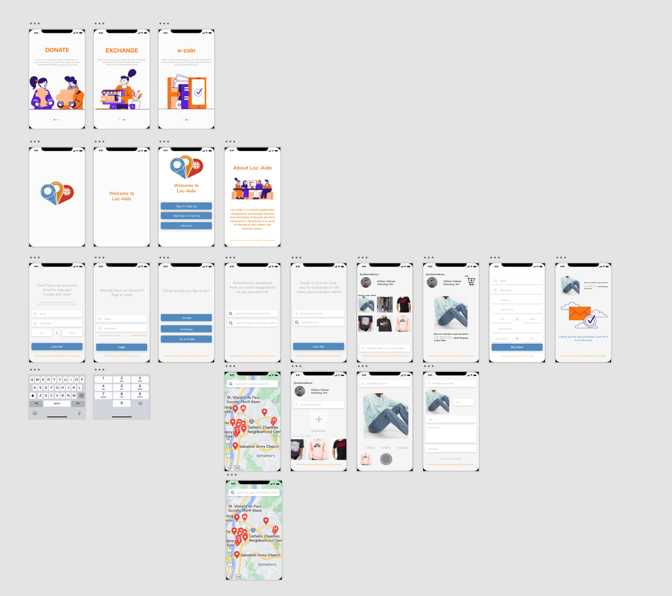
On-boarding:
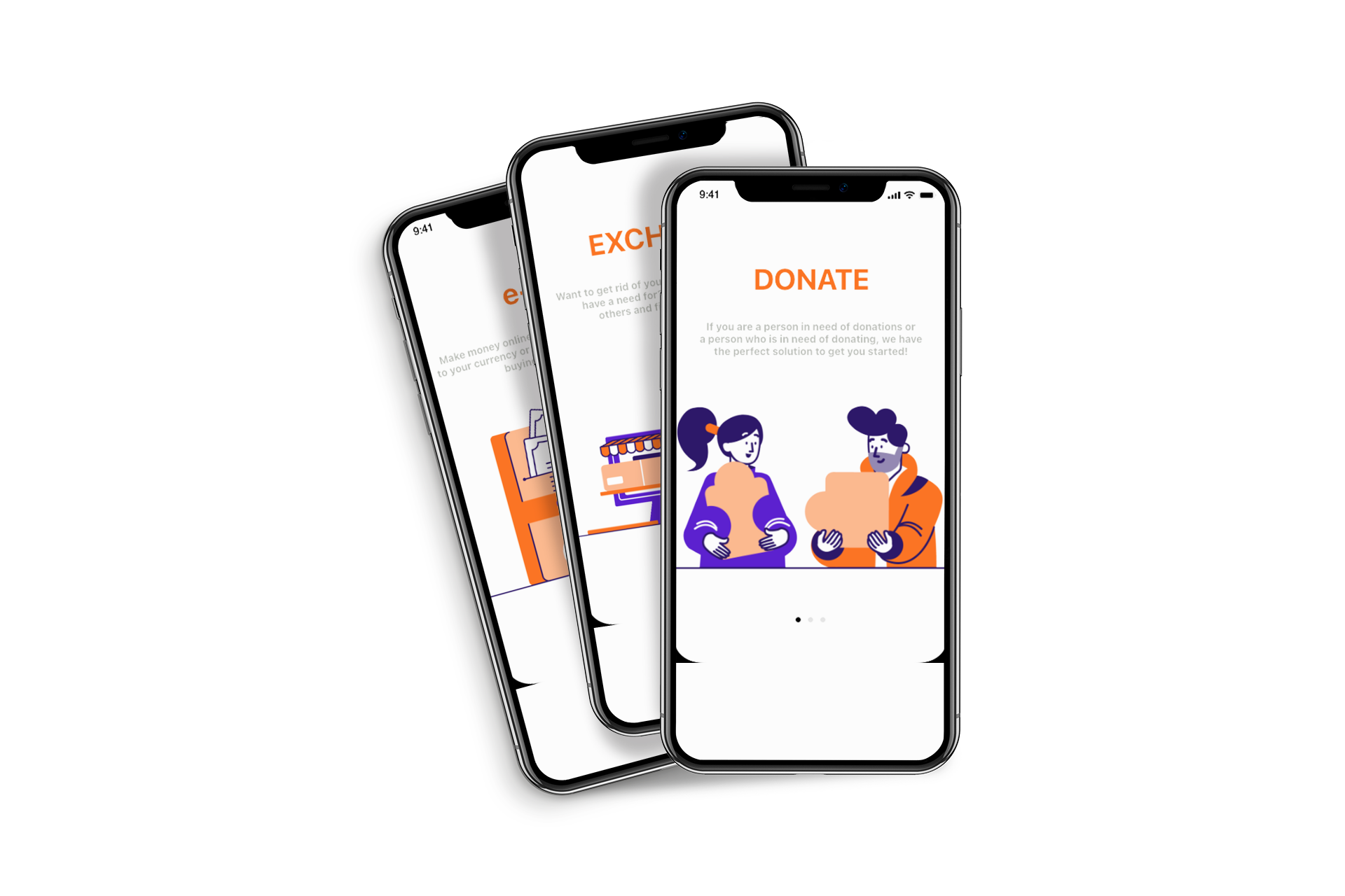
The onboarding section is a span of three screens that serves to introduce the app to the user and show what functions and abilities are offered by the app. It serves as a guide so the user becomes familiar with 3 main features of Loc-Aide: Donating, Exchanging and e-coin.
Wire-Frame
The wireframe section is a stage in which the layout of the application is taken into consideration and shows how the app will navigate. This section shows what icons will be used, where the action buttons will take you and how the user will journey through the app.
App Design Layout
The app design layout is the creation stage of the application. This stages works from the wire-frame design and puts the information collected into reality. This stage of the app is the creation of what will become the finished app.